I tried predicting a binary outcome with plain lm() a while back, coding the outcome as 0 or 1 and fitting a line through it the same way I would fit a line through a continuous target. It ran without complaint. The predictions it produced included numbers like 1.34 and negative 0.09, which are not probabilities and are not classes, and staring at that output was the first time it became obvious that classification is not regression with a different label on the y-axis. It needs its own machinery.
Why a straight line is the wrong shape
Linear regression assumes the relationship between predictors and the target is additive and unbounded, which is exactly right when the target genuinely is unbounded. A probability is not. It has to sit between 0 and 1, and a straight line fitted to 0/1 data has no way to respect that constraint, it will happily predict 1.3 for an observation with strongly positive features and keep going past that with more extreme inputs.
Logistic regression fixes this by not modelling the probability directly with a linear equation. It models the log-odds, log(p / (1 - p)), as a linear function of the predictors, then passes that through the logistic (sigmoid) function to squash the result back into the (0, 1) range.
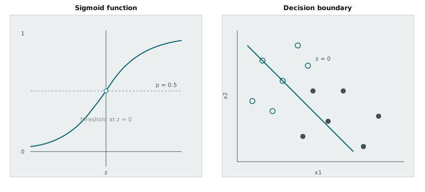
The sigmoid, 1 / (1 + exp(-z)), has the shape that diagram shows: flat near 0 for very negative z, flat near 1 for very positive z, and a smooth transition through 0.5 in between. Feed it the linear combination of predictors, z = w0 + w1*x1 + w2*x2 + ..., and the output is a genuine probability regardless of how extreme the inputs get. Threshold that probability at 0.5 and you get a class prediction, and because the sigmoid is monotonic, that threshold on the probability corresponds to a threshold on z itself, which is exactly z = 0. Since z is linear in the predictors, the boundary where z = 0 is a straight line (or a hyperplane with more than two predictors). That is the right panel of the diagram: logistic regression is a linear model, the same as ordinary regression, it is just linear in the log-odds rather than linear in the probability.
Fitting logistic regression in R
set.seed(7)
n <- 100
x1 <- rnorm(n, mean = 0, sd = 2)
x2 <- rnorm(n, mean = 0, sd = 2)
z <- 0.8 + 1.5 * x1 - 1.2 * x2
prob <- 1 / (1 + exp(-z))
y <- rbinom(n, 1, prob)

fit <- glm(y ~ x1 + x2, family = binomial(link = "logit"))
summary(fit)
glm() with family = binomial fits this by maximum likelihood rather than by minimising squared error, which makes sense once you accept that the target is now a probability of a Bernoulli outcome rather than a continuous quantity, and squared error was never the right loss for that. The coefficients that come back are on the log-odds scale, which is why exp(coef(fit)) is worth running immediately after, it converts each coefficient into an odds ratio, a number that says how much the odds of the positive class multiply by for a one-unit increase in that predictor, holding the others fixed. A coefficient of 1.5 on x1 becomes an odds ratio around 4.5, meaning the odds roughly quadruple for each extra unit of x1. That is a far easier thing to explain to someone than “the log-odds increase by 1.5.”
new_point <- data.frame(x1 = 1, x2 = -1)
predict(fit, newdata = new_point, type = "response")
type = "response" is the argument that trips people up the first time, predict() defaults to returning the linear predictor, z, rather than the probability, and forgetting to ask for "response" means comparing a log-odds value against a 0.5 threshold, which is wrong by a wide margin for anything other than exactly the boundary itself.
Moving past two classes
Logistic regression as I have described it handles two classes. Real problems often have more, and one of the more direct ways to get there without deriving softmax regression from scratch is the perceptron, extended to handle multiple classes by giving each class its own weight vector.
The single-class perceptron update rule is simple: for a misclassified point, nudge the weight vector towards the correct answer.
w <- w + learning_rate * (true_label - predicted_label) * xIf the prediction was correct, true_label - predicted_label is zero and nothing changes. If it was wrong, the weights shift in the direction that would have made this particular point classify correctly, by a step size controlled by the learning rate. Repeat that over the training data, in passes, until either every point classifies correctly or a maximum number of passes is reached.
Extending this to k classes means keeping k separate weight vectors, one per class, and at prediction time computing the score w_c . x for every class c and picking the class with the highest score, rather than thresholding a single score at zero.
train_multiclass_perceptron <- function(X, y, k, learning_rate = 0.1, epochs = 50) {
  n_features <- ncol(X)
  W <- matrix(0, nrow = k, ncol = n_features)

  for (epoch in 1:epochs) {
    for (i in 1:nrow(X)) {
      scores <- W %*% X[i, ]
      predicted <- which.max(scores)
      actual <- y[i]

      if (predicted != actual) {
        W[actual, ] <- W[actual, ] + learning_rate * X[i, ]
        W[predicted, ] <- W[predicted, ] - learning_rate * X[i, ]
      }
    }
  }
  W
}
The update on a mistake pushes the weight vector for the correct class towards this point, and pushes the weight vector for the (wrongly) predicted class away from it, so both errors get corrected in the same step rather than only one. Running this on a small synthetic dataset with three well-separated classes converges within a handful of epochs, and afterwards each class has a weight vector defining a scoring function over the feature space.
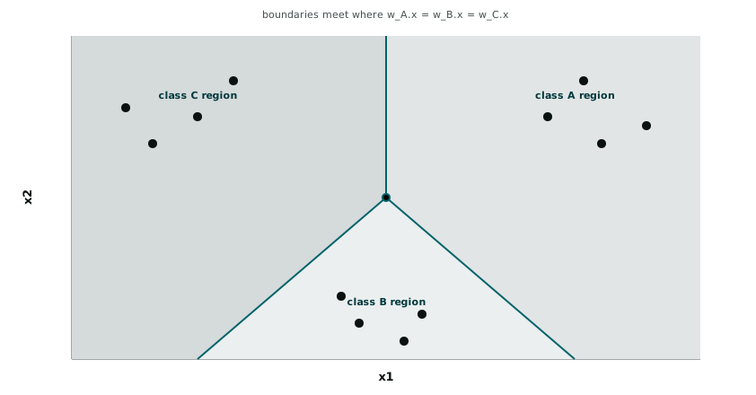
What that diagram is showing is the geometric consequence of scoring by w_c . x and taking the maximum. Each pair of classes has an implicit boundary where their two scores are equal, and those pairwise boundaries carve the feature space into regions, one per class, that meet at a single point roughly in the middle when the classes are arranged symmetrically. A new point gets assigned to whichever region it lands in, and unlike k-nearest-neighbours or a decision tree, the boundaries here are always straight lines, because each score is a linear function of the input.
Where the boundary is honest and where it is not
Both of these methods draw a straight line (or a set of straight lines) through the feature space and call everything on one side “class A” and everything on the other “class B.” That is a strong assumption, and it is worth being upfront about when it fails. Data that genuinely needs a curved boundary, two classes arranged as concentric rings, for instance, will not be separable by any straight line no matter how the weights are tuned, and both logistic regression and the perceptron will settle on the best straight line available, which for that shape of data might not be very good at all.
I have started checking this early now, plotting the two most important features against each other and colouring by class before fitting anything, specifically to see whether the classes look linearly separable at a glance. It is a rough check, only two dimensions at a time, but it has already saved me from trusting a perceptron’s convergence on data where a curved boundary was doing real work that a straight one could only approximate.