I ran kmeans() on the Fisher Iris measurements a few weeks ago, mostly to remind myself how the function’s arguments worked, and printed the cluster assignments next to the actual species labels. Most rows lined up the way you would expect. A handful sat right on the edge between versicolor and virginica, close enough on petal length and width that a human looking at the raw numbers would have hesitated. K-means did not hesitate. Every one of those borderline rows got assigned to exactly one cluster, with no record anywhere in the output that the decision had been close.
That bothered me more than it probably should have. K-means picks a cluster centre, measures distance from every point to every centre, and assigns each point to the nearest one. It is a hard boundary by construction, a Voronoi cell around each centre, and a point one millimetre inside that boundary gets treated identically to a point sitting dead centre in the cluster. The algorithm has no vocabulary for “I am not sure.” The EM algorithm does.
What “soft” actually means here
Expectation-Maximisation approaches the same problem, grouping points into clusters, from a different starting assumption. Instead of clusters being hard regions with sharp edges, it assumes the data was generated by a mixture of probability distributions, usually Gaussians, each with its own mean and covariance, and each point has some probability of having come from each component in the mixture. A point does not belong to cluster A. It belongs to cluster A with probability 0.7 and to cluster B with probability 0.3. That distinction sounds academic until you sit with actual borderline data, and then it looks like the more honest description of what the data is actually telling you.
The algorithm to fit that mixture works in two alternating steps, which is where the name comes from.
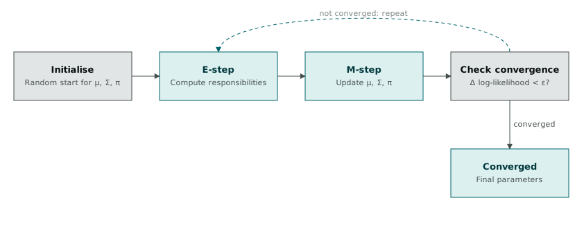
Start with some initial guess for each component’s mean, covariance, and mixing weight, often from a random split of the data or from running k-means first to get a sensible starting point. The E-step, expectation, computes for every point the probability it belongs to each component, given the current parameters. Those probabilities are called responsibilities, and they are exactly the “70% A, 30% B” numbers from above. The M-step, maximisation, takes those responsibilities and recomputes the mean, covariance, and weight of each component, but weighted by how responsible each point was for that component rather than by a hard yes or no. Recompute the responsibilities with the new parameters, recompute the parameters with the new responsibilities, and repeat until the change in log-likelihood between iterations drops below some small threshold.
There is no guarantee EM finds the global optimum. It is a hill-climbing method, and a poor starting point can walk it into a local maximum that fits the data worse than a different starting point would have. Running it from several random initialisations and keeping the fit with the highest log-likelihood is the standard defence against that, and it is what packages like mclust do for you without being asked.
Fitting a mixture in R
library(mclust)

fit <- Mclust(iris[, 1:4])
summary(fit)
Mclust() does more than run a single EM fit. Left to its defaults, it fits several different covariance structures, spherical, diagonal, and various ellipsoidal shapes, across a range of cluster counts, and picks the combination with the best Bayesian Information Criterion. For the iris measurements, this tends to land on two components rather than three, merging versicolor and virginica into a single cluster, because those two species overlap enough in petal length and width that BIC penalises the extra component needed to separate them.
That result annoyed me the first time I saw it, because I already knew there were three species and expected the model to recover exactly three clusters. It took a while to accept that the model was not wrong. Versicolor and virginica genuinely overlap in this measurement space, and BIC is telling you, correctly, that a simpler model treating those two as one group explains the data better than one pretending the boundary between them is clean.
plot(fit, what = "classification")
fit$parameters$mean
fit$z[1:10, ]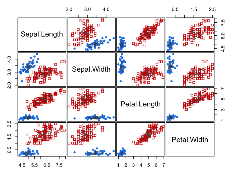
fit$z is the matrix that matters most for the point I am making here. Each row is one observation, each column is one mixture component, and the values are exactly the soft assignment probabilities the E-step computed. Printing the first ten rows shows most of them close to one component with the rest near zero, which is reassuring, most points really are unambiguous. A smaller number of rows show something closer to a 60/40 or 55/45 split, and those are the rows k-means would have silently forced one way or the other.
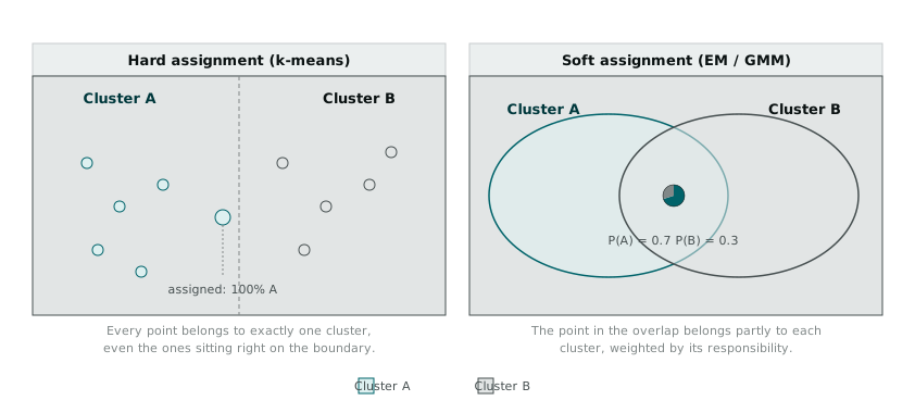
The diagram above is the distinction I keep coming back to. On the left, k-means draws a boundary and every point sits on one side of it, full stop. On the right, the two components overlap, and a point in that overlap carries a probability for each, visualised as a small pie rather than a single colour. Neither picture is more or less “correct” as a modelling choice. They answer different questions. K-means answers “which cluster should I put this point in if I have to choose exactly one.” EM answers “how much does this point look like each cluster, given everything I have seen.”
Checking whether the clustering is any good
Fitting a mixture is one thing. Deciding whether the resulting clusters actually reflect real structure, rather than the number of components you happened to ask for, is a separate question, and the clusterCrit package is where I have been going for that.
library(clusterCrit)

hard_labels <- as.integer(fit$classification)
scores <- intCriteria(as.matrix(iris[, 1:4]), hard_labels,
                       c("Silhouette", "Dunn", "Calinski_Harabasz"))
scores
clusterCrit needs a hard label per point to compute most of its internal validation indices, which means converting the soft EM output back into a single best guess per point before handing it to intCriteria(). That conversion feels slightly backward, given the entire argument above for keeping the soft assignments, but the indices themselves, silhouette width, the Dunn index, Calinski-Harabasz, are all built around the idea of measuring how well-separated a set of discrete clusters are. Comparing these scores across different values of k, or across a k-means fit against an EM fit reduced to hard labels, gives a way to sanity-check that the extra complexity of a mixture model over plain k-means is actually earning its keep on a given dataset, rather than just fitting noise more elaborately.
Why the extra complexity was worth it
Running both kmeans() and Mclust() on the same iris measurements, side by side, made the trade-off concrete in a way that reading about the two methods separately never had. K-means ran faster, needed one argument, centers, and produced a clean partition I could hand to almost anyone without further explanation. EM took longer, needed a package most people in the room had not used before, and produced an output, a matrix of probabilities rather than a vector of labels, that takes more work to communicate.
What EM gave back for that cost was the handful of rows where the model was genuinely unsure, and a number attached to that uncertainty instead of a coin flip dressed up as a decision. For a dataset where every point clusters cleanly, that extra information is wasted effort, k-means will get you the same answer faster. For the borderline cases, the ones sitting close to a boundary that was never as sharp as the algorithm’s output implied, it is the difference between a model that quietly guesses and one that tells you it is guessing.