I have been drawing trend lines in Excel for years. Select the scatter, right click, Add Trendline, tick the box for R-squared, done. Nobody ever asked me what that R-squared actually meant, and for a long time I did not ask myself either. It was a number that sat in the corner of the chart looking authoritative. Close to 1 was good. Close to 0 was bad. That was the entire model.
lm() in R draws the same line through the same points. The difference is that it will not let me stop at the line. It hands back coefficients, standard errors, a p-value for every term, an F-statistic for the model as a whole, and a set of diagnostic plots that ask, one by one, whether any of it can be trusted. The line is the easy part. Everything R makes me look at afterwards is the part Excel let me skip.
Exploratory first, confirmatory second
Before I fit anything I plot it, and I have started being deliberate about keeping those two activities separate in my head. Exploratory analysis is me looking at a scatterplot and letting a shape suggest itself: does this look roughly straight, is there a bend, is the spread of points constant across the range or does it fan out at one end. Confirmatory analysis is the model itself, the part that puts a number on whether the shape I think I saw is more than noise.
The trap in Excel was collapsing those two steps into one click. The trendline appears, the R-squared appears next to it, and it is easy to treat the second as confirmation of the first without ever separating “I looked at this and it seemed linear” from “I tested whether a linear relationship explains more of the variance than chance would.” Those are different claims. Only the second one needs a hypothesis test behind it.
plot(mtcars$wt, mtcars$mpg,
     xlab = "Weight (1000 lbs)", ylab = "Miles per gallon",
     main = "mpg vs weight")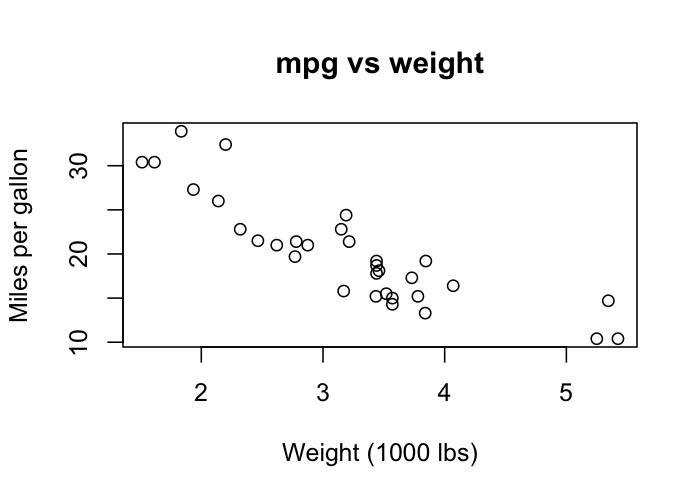
A quick look at this suggests a downward, roughly linear relationship, heavier cars getting worse mileage. That is the exploratory step. Fitting the line is where confirmatory analysis starts.
Fitting the model
fit <- lm(mpg ~ wt, data = mtcars)
summary(fit)
The output from summary() is where R stops being a plotting tool and starts being a statistics package. The coefficients table gives an estimate for the intercept and for the slope on wt, each with a standard error, a t-value, and a p-value. For this particular fit the slope comes out around -5.34, meaning every extra 1000 lbs of weight is associated with roughly 5.3 fewer miles per gallon, and the p-value on that slope is small enough that I would reject the idea that weight has no relationship to mileage in this data.
The R-squared sits further down the output, not at the top where Excel puts it. That placement matters. R is telling me, structurally, that the goodness-of-fit number comes after the question of whether the coefficients are distinguishable from zero, not before it. A high R-squared on a slope that is not statistically significant is not a good model. It is an accident of a small sample.
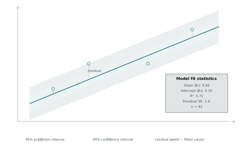
The diagram above is the piece Excel’s trendline never shows. A fitted line by itself looks precise. Wrap a confidence interval and a prediction interval around it and the honesty comes back: the confidence interval describes uncertainty about where the true regression line sits, the prediction interval describes uncertainty about where a new individual point would land, and the second band is always wider than the first because predicting one new observation is a harder problem than estimating the average trend. Excel’s trendline gives you the centre of that diagram and nothing either side of it.
What the residuals are actually for
A residual is the vertical distance between an observed point and the fitted line, y minus the model’s prediction for that x. Excel can compute this if you ask it to, but nothing in the default trendline workflow encourages you to look at the collection of residuals as its own object worth studying. In R, looking at residuals is close to compulsory, because plot() on a fitted model produces four diagnostic panels by default and ignoring them takes a deliberate choice not to run the line.
par(mfrow = c(2, 2))
plot(fit)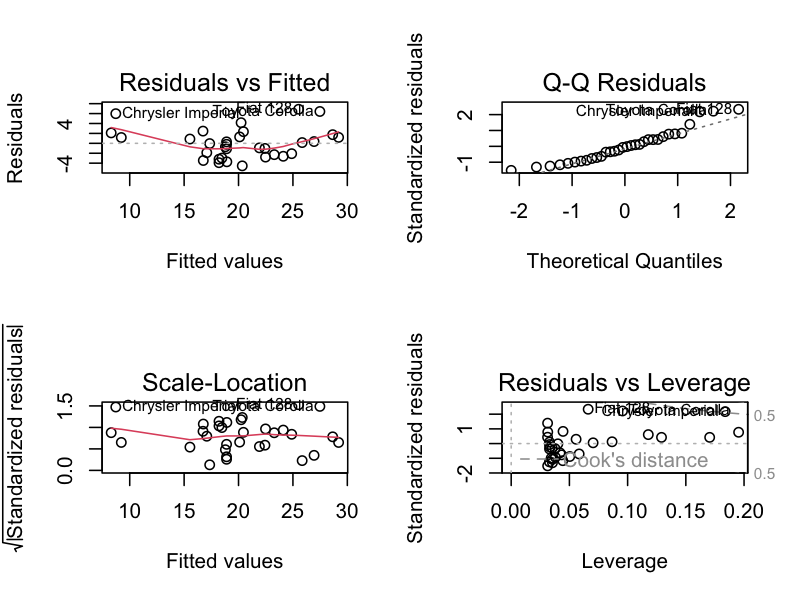
par(mfrow = c(2, 2)) arranges the next four plots into a 2x2 grid, which is how these diagnostics are almost always read together rather than one at a time.
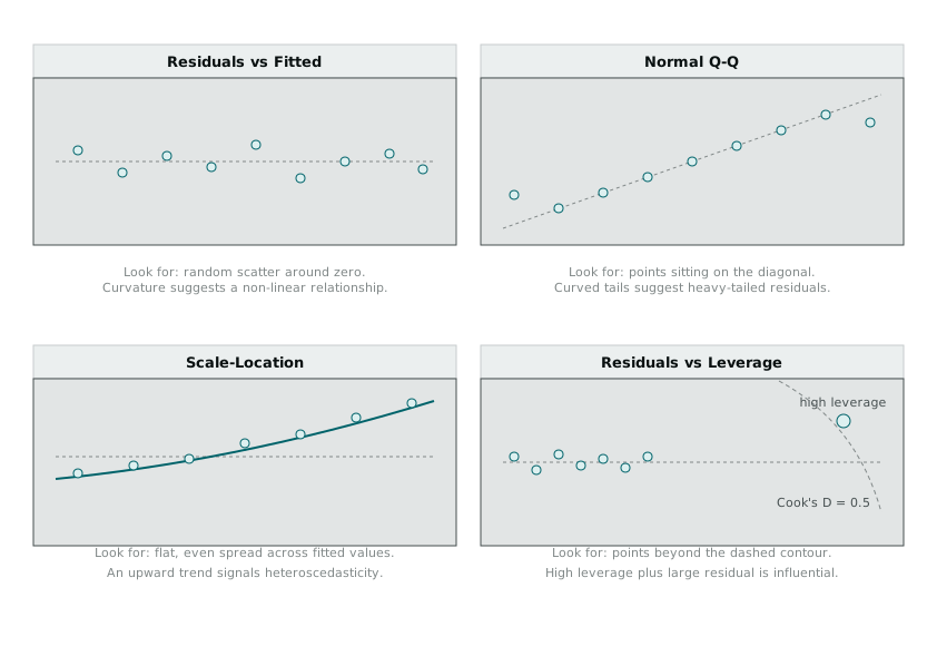
Residuals vs Fitted is the first thing I check, because it answers the question a straight line assumes away: does the relationship actually look straight once you strip out the trend. Random scatter around the zero line is what a linear model wants to see. A curve in that scatter means the model is missing something, usually a non-linear term or a variable that has not been included, and no amount of squinting at R-squared will tell you that on its own.
Normal Q-Q checks whether the residuals are roughly normally distributed, which matters because the p-values and confidence intervals from lm() lean on that assumption. Points sitting close to the diagonal are reassuring. Tails that peel away from it suggest the standard errors coming out of summary() should not be trusted at face value, particularly with a small sample.
Scale-Location is the same idea as the first panel but focused on variance rather than mean, checking whether the spread of residuals stays roughly constant across the range of fitted values. A funnel shape, tight on one side and wide on the other, is heteroscedasticity, and it is one of the most common ways a real dataset quietly breaks the assumptions behind an ordinary least squares fit.
Cook’s distance and the point that is running the show
The fourth panel, Residuals vs Leverage, is the one I had never seen before and the one I now think about the most. Leverage measures how far a point sits from the average of the predictor values, which is a proxy for how much influence that point has over where the fitted line goes. A point can have a small residual and still have enormous leverage, sitting close to the line precisely because the line has bent itself to accommodate that one observation.
Cook’s distance combines leverage and residual size into a single number for each observation, an estimate of how much the fitted coefficients would shift if that point were removed and the model refit without it.
cooksd <- cooks.distance(fit)
plot(cooksd, type = "h",
     main = "Cook's distance", ylab = "Cook's D")
abline(h = 4 / nrow(mtcars), col = "red", lty = 2)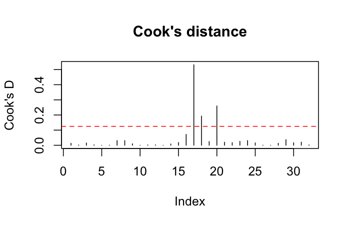
A common rule of thumb flags any point with Cook’s D greater than 4 divided by the sample size as worth a closer look, not automatic removal, a closer look. I ran this on a dataset a few weeks ago where the R-squared looked respectable, 0.68, and Cook’s distance flagged a single observation sitting well above that threshold. Refitting without it dropped the R-squared to 0.41. The relationship I thought I had found was real, but weaker than it looked, and most of the apparent strength had come from one point in the corner of the scatterplot pulling the whole line toward it.
That is the thing Excel’s trendline never asks me to check. A single influential point can make a mediocre relationship look convincing, and the chart itself gives no visual warning, because the line still passes close to most of the points. It takes Cook’s distance, or at minimum a residuals-versus-leverage plot, to catch it.
Where this leaves the trend line
I still reach for a scatterplot before I reach for lm(). Exploratory analysis has not stopped being useful, it is still the fastest way to catch an obviously wrong relationship before spending time modelling it properly. What has changed is what happens after the line goes on the chart. In Excel, the line and the R-squared were the answer. In R, they are the start of a set of questions: is the slope distinguishable from zero, do the residuals look like noise or like a pattern I have not modelled yet, is the fit being carried by the whole sample or by one point that happens to sit in a convenient place.
None of those questions require anything more advanced than lm(), summary(), and four default diagnostic plots. They were always there to ask. I had just never been handed a tool that made asking them the default rather than the exception.