Someone reviewing a report I had put together asked why a particular number was shown as a bar chart instead of a line. I did not have a real answer. The honest one was that geom_bar() was the function I reached for, the data had categories on one axis and a number on the other, and I had not thought about it any further than that.
That question stayed with me longer than it should have, because it exposed something. I had been treating visualisation as the last technical step after the analysis was finished: run the numbers, then call the right plotting function to show them. The chart type decision felt arbitrary precisely because I was making it after all the actual thinking had already happened. There was no design step. There was just an execution step.
A methodology built around paper, not software
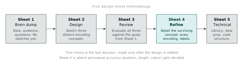
I came across a paper in IEEE Transactions on Visualization and Computer Graphics describing something called the Five Design-Sheet methodology. The core idea is unglamorous and, I think, correct: visualisation design should happen away from the computer, across five physical sheets of paper, before a single line of plotting code gets written.
The five sheets, in order:
Sheet 1: Brain dump. Everything relevant goes on the page without judgement. What data do I have. What are the fields, the ranges, the granularity. What questions am I actually trying to answer, and for whom. No sketches yet. This sheet is about clearing the ground so the design sheets that follow are not competing with half-formed ideas still rattling around.
Sheet 2: Design. Sketch three separate concepts, side by side, for the same underlying question. Not three versions of the same chart with different colours. Three genuinely different ways of encoding the same data: one might be a small-multiples grid, one a single dense chart with interaction, one a ranked table with embedded bars. The constraint of producing three forces you past the first idea, which is usually the most obvious and often not the best.
Sheet 3: Review. Evaluate the three concepts against the goals written down in Sheet 1. Which one actually answers the question a viewer will bring to it. Which one scales if the data doubles. Which one a colleague, looking at it cold, understands within ten seconds. This is the sheet where most of the discarding happens.
Sheet 4: Refine. Take the surviving concept and work through its details. Axis choices, colour encoding, labelling, what gets annotated and what gets left for the viewer to read off the scale. This is also where the perceptual questions below actually get decided.
Sheet 5: Technical. The implementation plan. What library, what data transformations are needed before plotting, what the code structure looks like. Only now does the tool choice matter.
What struck me on the first attempt was how much friction the method removes simply by ordering the decisions. I am used to making Sheet 5 decisions (which library, which function) at the exact moment I should be making Sheet 1 decisions (what am I actually trying to show). Separating them meant I stopped optimising for “what can ggplot2 do easily” before I had worked out what the chart needed to do at all.
Why the eye matters more than the chart type
Sheet 4 is where I had to learn something I had skipped past entirely: the human visual system processes some visual properties before conscious attention gets involved. Colin Ware’s work on preattentive attributes lays this out clearly. Colour, orientation, size, and motion get picked up by low-level visual processing in under 250 milliseconds, before the viewer has consciously decided to look for anything. Position on the page is processed the same way.
This matters for design because it means some encoding choices are almost free (the viewer notices them without effort) and others require active scanning and comparison. A dashboard that encodes the important number using colour hue against a busy multicoloured background is fighting the very mechanism that would otherwise make that number pop out instantly.
Gestalt principles sit alongside this. Proximity (things placed close together are read as related), similarity (things that look alike are read as belonging to the same group), and closure (the eye completes a shape from partial information) are not stylistic preferences. They describe how perception actually organises a visual scene, whether or not the designer intended it. Group two bars close together on a chart and a viewer will assume they belong together, regardless of what the underlying data says. I have made that mistake more than once, arranging categories alphabetically because it felt neutral, when alphabetical order silently implied groupings that had nothing to do with the data.
Cleveland and McGill’s ranking, and what it changes
The most useful single piece of research I found sits behind Sheet 4 refinement decisions directly: William Cleveland and Robert McGill’s 1984 study on graphical perception, which ranked how accurately people can judge different visual encodings of the same underlying quantity.
Position along a common, aligned scale comes out on top. Length is close behind. Angle and direction sit in the middle. Area, and especially volume, are read far less accurately, because the eye is bad at converting a two-dimensional or three-dimensional shape back into a single number. Colour saturation and hue sit near the bottom of the ranking for encoding a quantitative value, even though they are visually the most eye-catching.
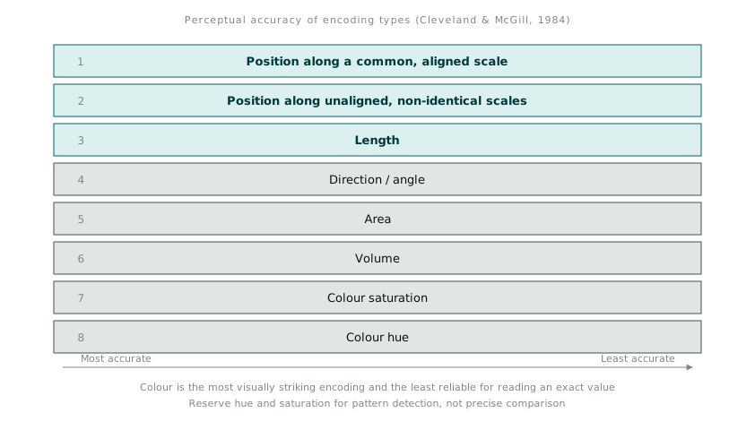
This reframed a habit I had not questioned: reaching for colour intensity to show magnitude because it looked more polished than a plain bar chart. A heat-map-style shading scale is visually striking, and it is also one of the least accurate ways to let someone read off an actual value. Position and length beat it every time a viewer needs to compare two numbers rather than just notice that something is “high” or “low” in a general sense.
None of this tells you which chart type to pick in isolation. What it gives you is a way to justify a choice once you have narrowed to a design at Sheet 3: if the goal is precise comparison, favour position and length encodings; if the goal is drawing attention to a general pattern across a large grid, colour intensity earns its place back, because coarse pattern detection is exactly what preattentive colour processing is good at.
I redid a monthly operations dashboard using this sequence properly for the first time this month. The brain dump sheet surfaced that half the fields I had been including answered a question nobody was actually asking. The three sketches on Sheet 2 included one option I would never have generated if I had jumped straight to code, a small-multiples layout that turned out to be the one people found easiest to scan. The refine sheet is where I swapped a colour-graded table for a simple horizontal bar ranking, because the actual use case was “which of these twelve regions needs attention first,” and that is a length-comparison question, not a colour-detection one.
The chart type was the last decision I made, not the first. That ordering is the whole method.