I have reported a mean and a percentile spread more times than I could count, usually without thinking hard about why those particular summary statistics are the ones worth trusting. A colleague asked me a plain question a few weeks ago that I could not answer cleanly: why does the average of a sample behave so predictably, even when the thing you are sampling from is nowhere near a bell curve itself. I gave a vague answer about “large numbers” and went looking for the real one afterwards. The real one is the Central Limit Theorem, and it turns out to be doing more of the load-bearing work behind ordinary reporting than I had given it credit for.
Three distributions worth knowing apart
Before the theorem makes sense, it helps to have a few actual distributions in view rather than treating “distribution” as one abstract idea.
The normal distribution is the one everyone already half-knows, the symmetric bell curve defined by a mean and a standard deviation. It shows up whenever a quantity results from adding together many small, roughly independent sources of variation, which turns out to describe an enormous number of real measurements: heights, measurement error, aggregated financial returns over short windows.
x <- seq(-4, 4, length = 200)
y <- dnorm(x, mean = 0, sd = 1)
plot(x, y, type = "l", main = "Standard normal density")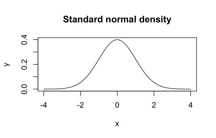
The binomial distribution is discrete rather than continuous, and it describes the count of successes across a fixed number of independent yes/no trials, each with the same success probability. Whether a customer converts on a landing page, whether a manufactured part passes inspection, whether a coin lands heads: run the trial n times at success probability p, and the binomial distribution describes how many successes you should expect and how much that count should vary.
k <- 0:20
p <- dbinom(k, size = 20, prob = 0.3)
barplot(p, names.arg = k, main = "Binomial(n=20, p=0.3)")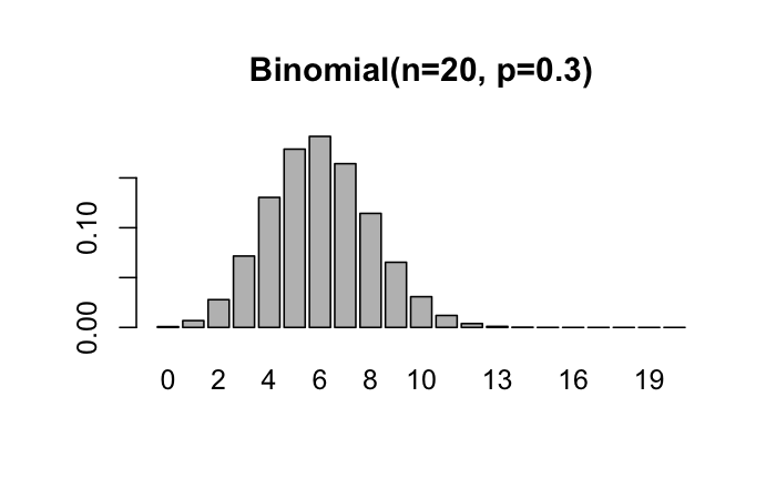
The Poisson distribution describes counts of events over a fixed interval, when those events happen independently at some average rate but the number of opportunities for an event to occur is effectively unbounded, rather than fixed at a known n the way the binomial assumes. Calls arriving at a support desk in an hour, defects per metre of cable, customers walking into a store in a given ten-minute window: all Poisson-shaped if the rate is roughly constant and one arrival does not make the next one more or less likely.
k <- 0:15
p <- dpois(k, lambda = 4)
barplot(p, names.arg = k, main = "Poisson(lambda=4)")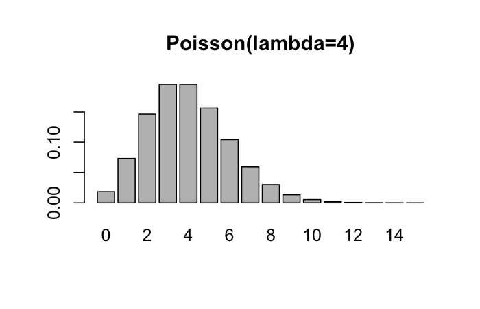
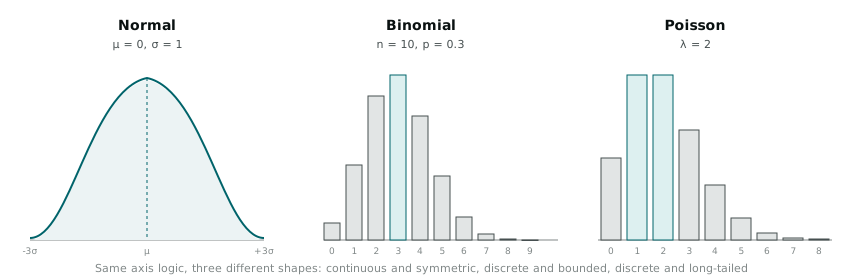
Laid out next to each other, the shape difference is the point worth keeping. The binomial is symmetric only when p is close to 0.5 and skews hard toward one tail otherwise. The Poisson is always right-skewed for small lambda, with a long tail toward rare high counts, and only starts to look approximately normal once lambda gets reasonably large. Neither one starts out looking like the bell curve, which is exactly what makes the next part of this interesting.
The theorem itself
The Central Limit Theorem says that if you take repeated random samples of a reasonably large size from almost any population, and compute the mean of each sample, the distribution of those sample means will approach a normal distribution as the sample size grows, regardless of the shape of the original population’s distribution. The population itself can be badly skewed, multi-modal, or bounded in some odd way. The distribution of sample means drawn from it still converges toward the familiar bell curve, provided the samples are reasonably large and the observations within each sample are independent.
I had used this fact for years through its consequences (confidence intervals, standard errors, the whole apparatus of inferential statistics that assumes near-normality of a sampling distribution) without connecting it explicitly to the mechanism producing it. Seeing it happen directly, rather than trusting it as an assumption baked into a formula, was worth the detour.
Watching it converge
I ran a small simulation in R using the Poisson distribution as the population, specifically because it starts out visibly skewed and is a fair test of whether the convergence claim holds rather than being trivially true of something close to normal already.
set.seed(42)
population_lambda <- 2

draw_sample_means <- function(n, reps = 2000) {
  replicate(reps, mean(rpois(n, lambda = population_lambda)))
}

means_n1   <- draw_sample_means(1)
means_n5   <- draw_sample_means(5)
means_n30  <- draw_sample_means(30)
means_n100 <- draw_sample_means(100)

par(mfrow = c(2, 2))
hist(means_n1,   main = "n = 1",   xlab = "sample mean", col = "grey80")
hist(means_n5,   main = "n = 5",   xlab = "sample mean", col = "grey80")
hist(means_n30,  main = "n = 30",  xlab = "sample mean", col = "grey80")
hist(means_n100, main = "n = 100", xlab = "sample mean", col = "grey80")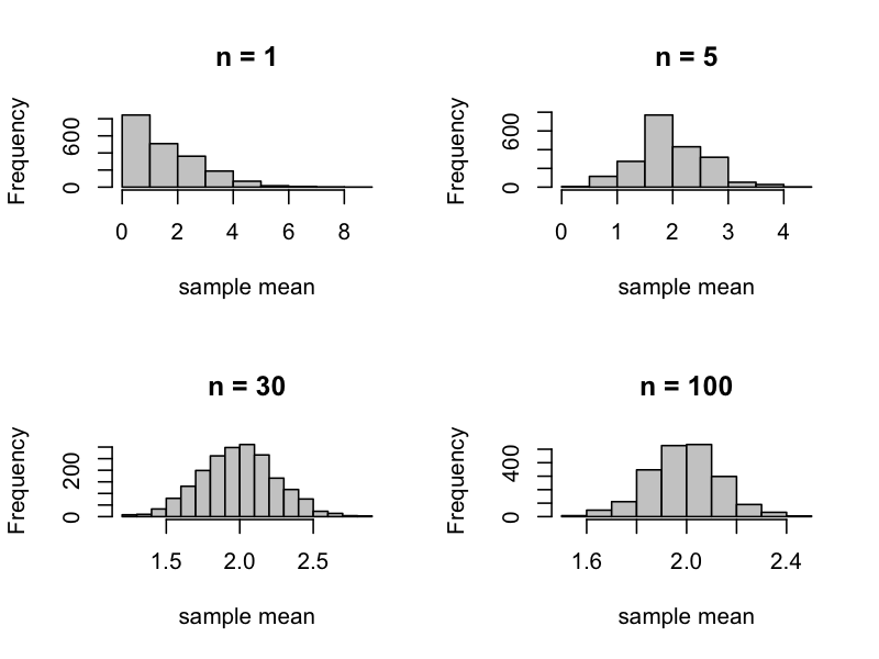
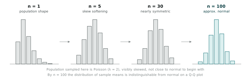
At n = 1, the histogram of “sample means” is the Poisson distribution itself, since a sample of one observation is trivially its own mean, and the skew is obvious: a spike near zero, a long right tail. By n = 5, the skew is still visible but softened. By n = 30, the histogram already looks close enough to a bell curve that I would not have picked it out as Poisson-derived without knowing where it came from. By n = 100, the resemblance to a normal curve is close enough that a normal quantile-quantile plot confirms it directly.
qqnorm(means_n100, main = "Q-Q plot, n = 100 sample means")
qqline(means_n100, col = "red")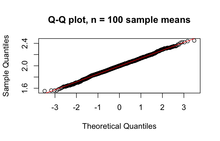
A normal Q-Q plot compares the sorted sample quantiles against the quantiles a perfectly normal distribution would produce at the same points. If the data were exactly normal, every point would sit on the diagonal reference line. The n = 100 version sits close to that line across almost its whole length, with the usual minor departure at the extreme tails that any finite sample shows. The n = 1 version, run through the same plot, would show a clearly curved departure from the line, because it is not sampling-mean data at all yet, it is the raw skewed population.
Why “n = 30” is not a magic number
I had heard the rule of thumb that thirty observations is “enough” for the Central Limit Theorem to kick in, stated as though it were a fixed law rather than a convenient approximation, and the simulation above is a reasonable illustration of why the number is a matter of degree rather than a threshold. Thirty observations from a moderately skewed Poisson population with lambda = 2 gets you most of the way to a usable normal approximation. The same sample size drawn from a distribution with a heavier tail or a more extreme skew would need more observations to get equivalently close, and a distribution that is already close to symmetric would need far fewer than thirty to look convincingly normal. Thirty is a rough, defensible default, not a constant of nature.
What this changes about reading a sample
Knowing the mechanism rather than trusting the output changed a specific habit of mine: I now look harder at what is being averaged before I trust a confidence interval built on top of it. A mean computed over a genuinely small sample, or over a population with an extremely heavy tail (certain cost or duration distributions common in operational data behave this way, with occasional extreme values dominating the total), deserves more scepticism than the same formula applied to a large sample from a well-behaved population, even though the formula for the standard error looks identical in both cases and will not warn you about the difference on its own.
None of this changes what number I report at the end of an analysis. I will still report a mean, a standard error, a confidence interval, because those are still the right summaries for the questions I get asked most often. It changes how much weight I put on that number when the sample behind it is small, or the population behind it is unusually shaped, because I now have a mental picture of the convergence process happening rather than a formula I trust because it is the one everyone uses.