I had a table of unemployment rates by statistical area and had already built the obvious things: a bar chart ranked by rate, a summary table sorted the same way. Both were correct and both were useless for the actual question someone asked me, which was “where is this bad.” A ranked bar chart tells you Region 14 has the highest rate. It tells you nothing about whether Region 14 sits next to Region 9, which also has a high rate, or whether the two are on opposite sides of the state. Adjacency is information. A pivot table throws it away by design, because rows in a table have no position relative to each other beyond their sort order.
That is what spatial data adds back in. A point, a line, or a polygon carries a location, and once geometry is in the data, distance, adjacency, and containment become things you can ask questions about directly, rather than things you infer from a region’s name and your own memory of a map.
Two families, and only one of them fits a choropleth
Before I got anywhere near leaflet, I had to get straight on what “spatial data” actually covers, because I had been using the term loosely to mean “anything with a latitude and longitude column,” which is wrong in a way that matters.
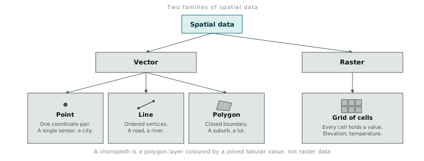
Vector data represents discrete features with exact geometry: a point is one coordinate pair, a line is an ordered sequence of coordinate pairs, a polygon is a closed boundary made of an ordered sequence that returns to where it started. Raster data is a different structure entirely: a grid of cells, each holding a value, with no individual cell “aware” of being a distinct feature. A digital elevation model is raster. A weather satellite image is raster. Neither one is a shape you can query for “does this fall inside boundary X,” because there are no boundaries in a raster, only cells and their values.
A choropleth map, which is what I actually needed, is a vector construction. It colours polygons (statistical areas, in my case) according to a value joined in from a separate table. Getting that distinction straight up front saved me from a wrong turn I watched a colleague take: trying to interpolate unemployment rate into a continuous raster surface, because “smoother gradients look nicer,” when the underlying data was inherently discrete by region and had no meaning between region boundaries. A rate exists per region. It does not exist at the specific point halfway between two region centroids, and pretending otherwise with a smoothed raster surface manufactures precision that is not there.
R’s spatial stack, circa this project
The R packages doing the geometry work are sp, which defines the SpatialPolygonsDataFrame and related classes most other spatial packages build on, rgdal, which handles reading shapefiles and other geographic file formats into those classes, and maptools, which fills in a handful of manipulation functions the other two do not cover. None of these are visualisation packages by themselves. They are the plumbing that gets a shapefile into a data structure R understands as having geometry, not just numbers.
library(sp)
library(rgdal)

boundaries <- readOGR(dsn = "sa2_boundaries", layer = "SA2_2016_AUST")
class(boundaries)
# [1] "SpatialPolygonsDataFrame"
readOGR reads the shapefile’s geometry and its attribute table together into one object. The attribute table that ships with a boundary shapefile usually has almost nothing useful in it beyond an area code and a name. The unemployment rate data lives in a completely separate CSV, keyed by the same area code, and getting the two joined correctly turned out to matter more than anything about the map styling that came after it.
The join is the part that actually breaks
unemployment <- read.csv("unemployment_by_sa2.csv", stringsAsFactors = FALSE)

boundaries@data <- merge(
  boundaries@data,
  unemployment,
  by.x = "SA2_MAIN16",
  by.y = "region_id",
  all.x = TRUE
)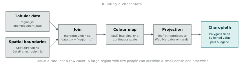
merge() here is operating on boundaries@data, the attribute table slot of the spatial object, not the geometry itself, which is exactly why this works: the geometry stays untouched, and only the attribute table gains the new column, matched row for row against the polygon it belongs to. The join key is where things went wrong the first time. The boundary shapefile’s area codes were nine-digit integers. My CSV’s area codes had been read in with a leading zero stripped by an earlier export step, so "012345678" had become 12345678, and the join silently matched nothing for every code that used to start with a zero. merge() does not warn you about unmatched rows by default. all.x = TRUE kept every polygon regardless of match, which meant the failure showed up as blank grey regions on the finished map rather than an error, and I only caught it because a colleague asked why half the state had no data when I knew the source CSV was complete. I now check sum(is.na(boundaries@data$unemployment_rate)) immediately after every spatial join, before doing anything else with the result.
Colour is doing more work than styling
Choosing how to bin the rate into colour categories is not a cosmetic decision. cut() splits a continuous variable into discrete bins, and where those bin boundaries fall changes what a reader concludes about which regions are “high.”
library(RColorBrewer)

boundaries@data$rate_bin <- cut(
  boundaries@data$unemployment_rate,
  breaks = c(0, 4, 6, 8, 100),
  labels = c("Under 4%", "4-6%", "6-8%", "Over 8%")
)

pal <- colorFactor(brewer.pal(4, "YlOrRd"), boundaries@data$rate_bin)
I picked those specific break points (4, 6, 8) after looking at the actual distribution, not by defaulting to equal-width bins, because the data clustered between 3% and 9% with a long thin tail past that. Equal-width bins across the full range would have thrown almost every region into one or two categories and made the map nearly monochrome, which defeats the entire point of colouring it. RColorBrewer’s sequential palettes exist specifically because an arbitrary rainbow gradient does not have a stable perceptual ordering: a viewer cannot reliably tell whether green or blue represents the higher value without checking the legend every time, whereas a single-hue sequence from pale to saturated reads as “more” without any lookup required.
Normalising by the right denominator matters as much as the bin choice. A raw count choropleth (total unemployed people, not the rate) makes densely populated regions look artificially severe purely because they have more people in them, which is the same distortion a choropleth is supposed to fix, just moved to a different axis. I used the rate throughout for that reason, and it is the first thing I now check on anyone else’s choropleth before trusting what it seems to show.
Rendering it with leaflet
library(leaflet)

leaflet(boundaries) %>%
  addProviderTiles("CartoDB.Positron") %>%
  addPolygons(
    fillColor = ~pal(rate_bin),
    fillOpacity = 0.75,
    color = "#444444",
    weight = 1,
    popup = ~paste0(SA2_NAME16, ": ", unemployment_rate, "%")
  ) %>%
  addLegend(pal = pal, values = ~rate_bin, title = "Unemployment rate")
leaflet handles the coordinate reprojection at render time, taking the boundary data’s stored projection and converting it to Web Mercator, which is what the base map tiles are drawn in. I did not have to think about this at all until I loaded a second shapefile from a different source later and the two layers rendered offset from each other by a visible margin, because the second file had been supplied in a different coordinate reference system that leaflet had no way to guess. Setting the CRS explicitly with spTransform() before plotting fixed it, but it was a reminder that “it renders” and “it renders in the right place” are not the same check, and the map will happily draw wrong coordinates without complaint if you never compare them against something you already know the shape of.
The finished map answered the original question in a way the bar chart never could. Region 14’s high rate sat inside a visible cluster of four adjacent regions, all elevated together, which reframed the conversation from “why is this one region bad” to “what is happening across this whole corridor,” a question nobody had thought to ask from the ranked list alone.