I was handed a project brief a few weeks ago that said, in full: “build a model to predict customer churn.” Nothing about where the customer data lived, whether the churn definition was agreed with anyone, or what would actually happen once a prediction existed. I drew the real shape of the work on a whiteboard before touching a line of code, because the brief described maybe one-fifth of what the project would take.
What I drew was a sequence I had drawn before, on other projects, without ever calling it anything. It turns out several people had already named it, and their names for it disagree in the details while agreeing almost completely on the shape.
Same shape, three names
The version I use most is what I have taken to calling the Standard Value Chain: Collection, Engineering, Governance, Wrangling, Analysis, Presentation, Operationalisation. I wrote about where I sit inside this chain recently, and the chain itself is worth looking at more closely, because three groups have written versions of it that only partly agree.
CSIRO’s Data61 group frames the sequence around five stages: acquisition, extraction, integration, analysis, and interpretation. Their language leans toward the technical side of the pipeline. “Extraction” and “integration” are what I would call wrangling and engineering, split into two separate concerns because CSIRO’s audience cares about the distinction between pulling structured fields out of messy sources and stitching separate sources together.
Pivotal’s version (their consultants published a widely shared “data science process” diagram) uses discovery, data preparation, model planning, model building, operationalisation, and communication. This one is written for a team that already assumes the end goal is a model. Discovery and data preparation map onto collection and wrangling. Model planning and model building are a more granular split of analysis than any other framework bothers with. Communication and operationalisation sit at the end, treated as two distinct deliverables rather than one.
Miller and Mork’s 2013 paper “From Data to Decisions” is the most academic of the three, and it is the one that pays the most attention to governance. Their stages are discovery, curation, integration, and exploitation, and “curation” is explicitly about ownership, quality, and provenance, which the other two frameworks either fold into preparation or skip entirely.
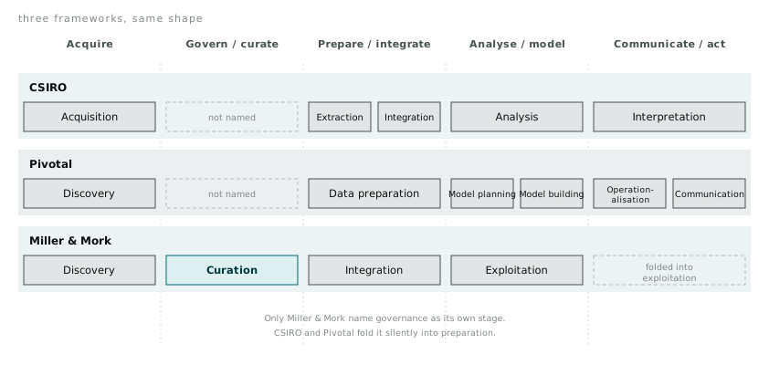
Line the three up and the overlap is obvious. Every framework has a stage for getting the data. Every framework has a stage for shaping it into something usable. Every framework has a stage for the modelling or analytical work. Where they disagree is how finely they slice the middle, and whether they bother naming governance as its own thing at all.
CSIRO and Pivotal both treat governance as implicit, something that happens inside data preparation rather than as a checkpoint of its own. Miller and Mork give it a name. I think Miller and Mork are right to, and I think the other two frameworks skip it because it is the least glamorous stage to put in a diagram, not because it matters less. Every project I have worked on that went sideways went sideways because nobody agreed early on what a field actually meant, who was responsible for it, or whether the source system’s definition of “customer” matched the definition the business team had in their head.
Where the frameworks actually help
None of this three-way comparison matters if it stays academic. It earns its place on a whiteboard because it gives me language to argue about scope before a project starts, rather than discovering the gaps once I am three weeks in.
The churn brief I mentioned at the start had a model planning and model building stage implied in the two-sentence ask. It had nothing for discovery, curation, or communication. When I went back with a version of the chain filled in, roughly half the meeting time went to two questions that had never been asked out loud: who decides what counts as churned (a customer with no activity for 90 days, or one who has explicitly cancelled), and which system is the source of truth for the account status field once that definition is settled. Neither question is analysis. Both had to be answered before analysis could start, and neither would have surfaced from a brief that only names the modelling stage.
That is the practical value of having three frameworks rather than one. Where they overlap, I trust the overlap, because three independent groups converging on the same core stages is a stronger signal than any one group’s opinion. Where they diverge, I use the divergence as a checklist. CSIRO’s split between extraction and integration reminds me to ask whether I am pulling one source or stitching several together, because the second is a materially harder problem that gets hidden inside a single “data preparation” box in Pivotal’s version. Miller and Mork’s curation stage reminds me to ask the ownership question before the modelling question, every time, because it is the one most frameworks let me skip by accident.
Making the decision structure explicit
The other tool that has been useful, once the chain is mapped, is drawing the decision itself as an influence diagram. This is a older idea from decision analysis, not something specific to data work, but it fits the operationalisation end of the chain well, because that is where “we built a model” has to turn into “someone or something acts differently.”
An influence diagram has four kinds of node. Chance nodes (drawn as ovals) represent things you cannot control and can only estimate: will this customer actually churn, will the promotion move enough volume to matter. Decision nodes (rectangles) represent choices someone actually makes: offer the discount or do not, set the price at this level or that one. Deterministic or known nodes (rectangles with a double border) represent things that are fixed inputs, calculated directly from other nodes with no uncertainty involved: the cost of the discount, the contractual minimum price. Objective nodes (diamonds or hexagons) represent what you are actually trying to optimise: retained revenue, margin, whatever the number is that the whole exercise is meant to move.
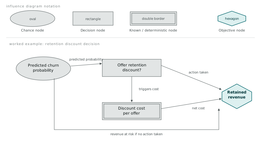
Drawing the churn problem this way exposed something the value chain framework alone did not. The chance node “will this customer churn” was well specified. The decision node “offer a retention discount” was not connected to anything, because nobody had decided what triggered the offer, at what threshold of predicted churn probability, or what discount size. The model could produce a probability for every customer. Nothing downstream had been built to consume that probability and turn it into an action. The influence diagram made that gap visible in a way “we need a model” never would, because the missing edge between the chance node and the decision node is exactly the operationalisation work that gets skipped when a project brief stops at “predict.”
The gap between the diagram and the desk
I do not think any of the three frameworks, or the influence diagram on top of them, describes the actual experience of doing this work. What they describe is the shape of the problem, cleanly, in a sequence that reads well in a proposal document. The actual experience is closer to bouncing backward through the chain constantly: you get partway through wrangling, discover the governance question was never actually resolved, go back and resolve it, and only then continue. Real projects loop. The frameworks draw straight lines because straight lines are easier to publish.
What the frameworks are good for is not describing my week. It is giving me a shared vocabulary to point at where a project is stuck, and enough structure to catch the governance and operationalisation gaps that a two-sentence brief will happily skip past. I would rather spend an extra hour drawing the chain and the influence diagram before a project starts than discover three weeks in that nobody agreed on what the model was actually meant to change.