A stakeholder asked me last week whether the dashboard I had delivered was “using predictive analytics.” It was not. It was a set of monthly totals broken down by region, with a trend line drawn through the last twelve points because Excel makes that one click. I told her the truth, that it described what had already happened and did not forecast anything, and she looked faintly disappointed, as if I had undersold the work by admitting it. I had not undersold it. I had correctly named the level of analytics it sat at, which turned out to be a harder conversation than building the dashboard was.
That conversation sent me looking for a clean way to describe the levels, because “is this predictive” kept coming up and I did not have a fast answer. What I found was a spectrum most people compress into three names, and one extra step hiding quietly inside the compression that most explanations skip past.
Three names, one hidden fourth
The framework almost everyone reaches for has three levels. Descriptive analytics summarises what happened: totals, averages, counts, the kind of report most business intelligence tooling exists to produce. Predictive analytics estimates what is likely to happen next, using patterns in historical data to forecast an outcome that has not occurred yet. Prescriptive analytics goes one step further and recommends what to do about it, turning a forecast into a specific action under a specific set of constraints.
I have also seen the spectrum drawn with eight levels rather than three, in a maturity model an SAS presentation used to illustrate the same idea with more granularity: standard reports, ad hoc reports, query drill-down, alerts, statistical analysis, forecasting, predictive modelling, and optimisation. Lay the eight against the three and they nest cleanly. The first four are descriptive analytics wearing different clothes: a report is a report whether it is scheduled or ad hoc, and an alert is a report that fires itself when a threshold trips. Statistical analysis is where a fourth level, diagnostic analytics, earns its own name, sitting between descriptive and predictive and asking why something happened rather than merely what happened or what will happen next. Forecasting and predictive modelling are predictive analytics split by technique rather than by kind. Optimisation is prescriptive.
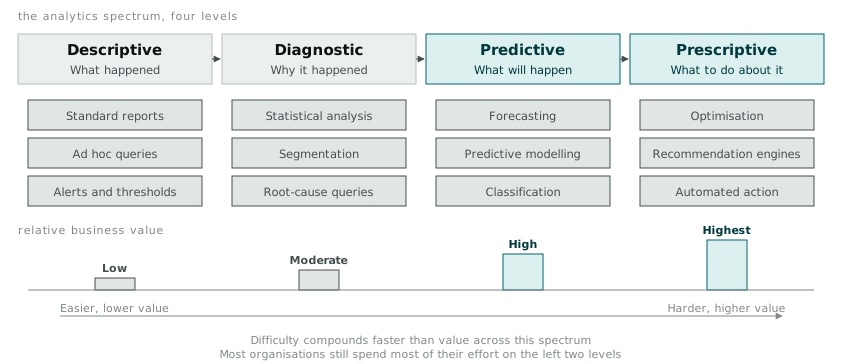
Diagnostic is the level most three-level explanations quietly fold into descriptive, and I think that flattening loses something. Descriptive analytics answers “how many customers churned last quarter.” Diagnostic analytics answers “why did they churn,” which usually means slicing the same data by segment, running a correlation or two, and building a case for a cause rather than reporting a number. It still looks backward. It is a meaningfully harder skill than counting rows, and it is the level most of my own work sits at once I stopped calling it descriptive out of habit.
Where the value concentrates, and where the difficulty does too
The four levels are usually drawn as a rising line, value increasing as you move right, and that part of the picture is accurate. What the rising line hides is that difficulty rises faster than value does, particularly across the jump from diagnostic to predictive. Going from descriptive to diagnostic mostly costs you more careful querying and a willingness to ask a second question after the first one. Going from diagnostic to predictive costs you a model, a validation strategy, a plan for what happens when the model is wrong, and an answer to the question of what decision changes because a probability now exists where a fact used to be.
Netflix’s recommendation engine is the example everyone reaches for, and it earns the reach. Predicting which title a specific account is likely to watch next, well enough to keep a subscriber from clicking away, requires collaborative filtering across viewing histories at a scale no manual segmentation could approximate. The value is obvious and well documented: Netflix has stated publicly that the recommendation system is responsible for a large share of what gets watched on the platform, because most viewers pick from what is surfaced to them rather than searching for something they already know they want. That is predictive analytics doing exactly what the diagram promises, given a dataset large enough and a prediction target narrow enough that pattern-matching at scale works.
Medical imaging sits closer to the diagnostic-to-predictive boundary than the recommendation example does, and it is a more honest picture of how hard the jump is. A radiologist reading a scan and flagging a suspicious mass is diagnostic work in the analytics sense too, even though nobody in the hospital would call it that: pattern recognition against a known history of what malignant tissue looks like, applied after the fact to an image that already exists. Algorithmic approaches to the same task, using image classification to flag likely malignancy before a radiologist looks, are predictive in that they estimate an outcome (malignant or not) that has not been confirmed yet. The results published so far are promising on narrow, well-labelled tasks and nowhere near a wholesale replacement of the diagnostic step, and every serious account of the work I have read stresses how much the model quality depends on the labelling quality of the training set, which is itself an unglamorous descriptive and governance problem wearing a predictive coat.
Electricity demand forecasting is the case that made the value-versus-difficulty gap concrete for me, because I could see all four levels stacked on top of each other in the same problem. A network operator’s descriptive layer is straightforward: historical load by half-hour interval, plotted and reported. The diagnostic layer explains the shape of that load against temperature, day of week, and known events, which is where most of the interesting exploratory work happens. The predictive layer forecasts tomorrow’s load from the same variables, and this is where the field usually stops when people say “we do predictive analytics,” because a forecast alone is already useful for staffing and short-term planning. The prescriptive layer is a different animal again: given a forecast, and given the cost of over-provisioning against the cost and risk of under-provisioning, what generation capacity should be dispatched, and at what price should demand response be offered to shift load away from the peak. That last question is an optimisation problem sitting on top of a forecast sitting on top of a diagnosis sitting on top of a report, and every layer under it has to be right before the layer above it is worth trusting.
Where I sit, and what moving up costs
Most of my day-to-day work is descriptive, with diagnostic work showing up whenever a number looks wrong enough that someone asks why. I have built almost nothing that would honestly qualify as predictive, and nothing at all that qualifies as prescriptive.
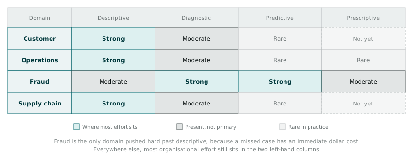
Looking at where organisations cluster against where the value concentrates, the gap between the two is the whole story. Customer analytics has plenty of descriptive reporting (lifetime value dashboards, churn counts) and a growing amount of diagnostic work, but predictive churn modelling that changes a retention offer before the customer leaves is rarer than the marketing material for most analytics platforms would suggest. Fraud detection is the domain that has pushed furthest toward predictive and even prescriptive, largely because the cost of a false negative is immediate and measurable in dollars, which is precisely the condition that makes the harder investment easy to justify to a budget holder. Supply chain sits mostly at descriptive and diagnostic in my experience, reporting on stock levels and explaining shortfalls after they happen, with predictive demand forecasting present but far from universal and prescriptive inventory optimisation still closer to a vendor pitch than a common practice.
None of that is a criticism of the organisations sitting at descriptive and diagnostic. Most decisions genuinely do not need a forecast, and building a predictive model for a decision nobody is going to act on differently is wasted effort dressed up as sophistication. What I take from the framework is narrower and more useful than a mandate to climb it: know honestly which level a piece of work is operating at, say so plainly when someone assumes it is a level higher, and treat the jump from diagnostic to predictive as the real investment it is rather than the next checkbox on a maturity slide. The dashboard I built last week was a good dashboard. It was also, honestly, a descriptive one, and telling the stakeholder that clearly was more useful to her than letting the ambiguity stand.