I had the same regional sales dataset open in three different tools within the space of a fortnight: Tableau Public, R with ggplot2, and D3.js. It was not a deliberate experiment at first. I built the first version in Tableau because it was fast, rebuilt it in R because I needed a specific statistical annotation Tableau does not do well, and then rebuilt it again in D3 because I wanted a single interactive view that none of the other two could produce cleanly. By the third rebuild I had noticed something odd: each tool had made me pay attention to a different part of the same data.
Tableau: drag, drop, notice
Tableau Public’s whole interaction model traces back to VizQL, the query language Chris Stolte and Pat Hanrahan built out of the Polaris research project at Stanford. The pitch of VizQL is that dragging a field onto a shelf is itself a query, translated behind the scenes into the aggregation and grouping needed to draw the chart. You never write the query. You drag a field, and the chart either looks right or it does not, and you drag something else.
What that interaction model actually changes is the pace of exploration. I dragged “region” onto columns, “sales” onto rows, and had a bar chart in four seconds. I dragged “date” onto the same shelf and had a time series a second later. Colour by “category” took one more drag. None of this required me to write code, which meant none of it required me to stop and think about implementation while I was still trying to understand the data.
The trade-off shows up the moment you want something Tableau was not built to show directly. I wanted a confidence interval band around a trend line. Tableau can approximate this with reference bands and calculated fields, but it is a workaround, not a first-class feature, and it took longer to fake than it would have taken to write in R. Tableau is built for rapid exploration of aggregates and drag-and-drop dashboards for a business audience. It is not built as a statistical graphics environment, and it shows the moment a question needs one.
R and ggplot2: thinking in layers
Moving the same data into R meant moving into a completely different mental model. Leland Wilkinson’s “The Grammar of Graphics” set out the idea that any statistical chart can be decomposed into a small set of independent components: data, a coordinate system, a set of aesthetic mappings from data to visual properties, one or more geometric objects, and optional statistical transformations and facets. Hadley Wickham’s ggplot2 is a direct implementation of that idea in R, and using it means thinking in those layers whether you intend to or not.
ggplot(sales_data, aes(x = month, y = revenue, colour = region)) +
  geom_line() +
  geom_smooth(method = "loess", se = TRUE) +
  facet_wrap(~ category) +
  theme_minimal()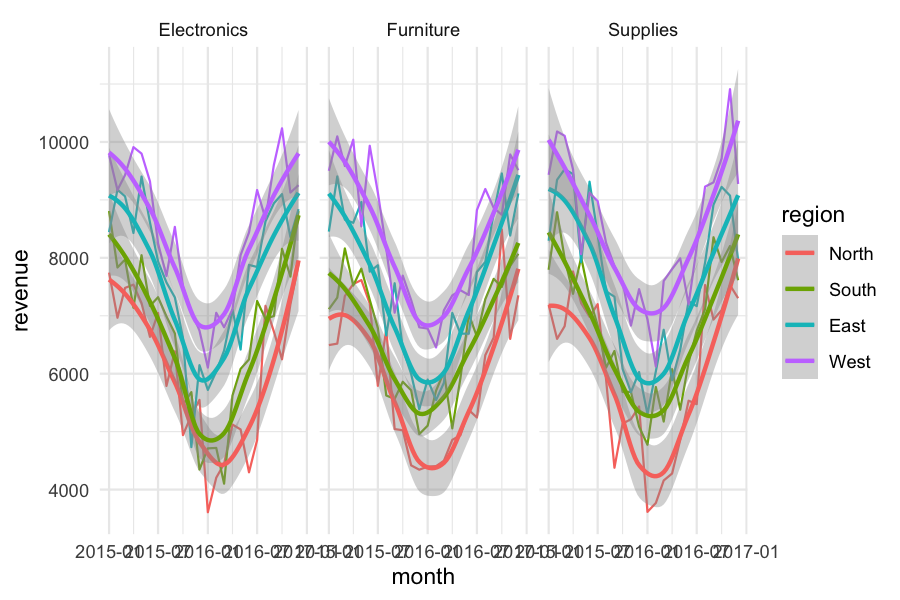
Every line in that call is a separate, composable idea. aes() maps data fields to visual channels. geom_line() says how to draw the mapped data. geom_smooth() layers a statistical model directly on top, confidence band included, in one function call, which is exactly the thing that took me three workaround attempts in Tableau. facet_wrap() produces small multiples without any manual layout work. theme_minimal() changes the presentation without touching any of the data logic underneath it.
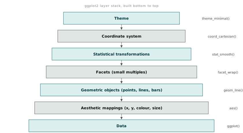
The layer model changes what you notice because it forces you to be explicit about things Tableau lets you skip. Deciding whether a smoothing method is LOESS or a linear fit is a decision Tableau’s trend line feature makes mostly invisible. In ggplot2 you name it. That explicitness slows you down relative to Tableau, and it also stops you from publishing a trend line without knowing what produced it, which I am fairly sure I have done in Tableau at least once without noticing.
D3.js: thinking in data joins
D3 is not a charting library in the way the first two tools are chart tools. Mike Bostock, Vadim Ogievetsky, and Jeffrey Heer’s original D3 paper describes the core idea plainly: bind an array of data to a selection of DOM elements, and let the data drive what happens to those elements when it changes. There is no geom_bar(). There is a data join, and then you write the code that says what a bar actually is.
var bars = svg.selectAll("rect")
    .data(salesByRegion)
    .enter()
    .append("rect")
    .attr("x", function(d, i) { return i * barWidth; })
    .attr("y", function(d) { return height - yScale(d.sales); })
    .attr("width", barWidth - 2)
    .attr("height", function(d) { return yScale(d.sales); })
    .attr("fill", "#4a90a4");
That is roughly the code needed to draw what geom_bar() gives you in one word, or one drag in Tableau. The point of D3 is not that this is a good way to draw a bar chart. It is that once the data join exists, transitions, brushing, zooming, and cross-filtering between multiple linked views are all just more code written against the same join, rather than features you hope the tool happens to expose. I built a linked view where clicking a region in a bar chart filtered a separate scatter plot of the same dataset, something neither Tableau nor a static ggplot2 plot does without a completely different tool bolted on (Shiny, in R’s case).
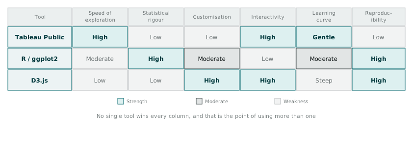
What each tool made me notice
The interesting part, setting the three versions side by side, is not which one is “best.” It was that each tool’s model of interaction pointed my attention somewhere different in the same data.
Tableau’s drag-and-drop pace got me through a broad first pass fast enough that I found an odd dip in one region’s sales within minutes, just by dragging fields around and looking. I would not have found it as quickly writing code, because writing code has a much higher cost per attempt, and I would have tested fewer combinations.
Ggplot2’s layer model, by forcing me to name the statistical transformation explicitly, made me actually check whether that dip was real or a LOESS smoothing artefact. It was real. I would not have asked the question in Tableau, where the smoothing method sits behind a checkbox I am not sure I have ever read the tooltip on.
D3’s data-join model, once I built the linked filtering view, let a colleague click through regions themselves and find a second, smaller anomaly in a different category that I had not looked for at all, because I was not the one driving the exploration by that point. Interactivity handed to someone else surfaces different questions than the ones the person who built the chart already had in mind.
None of the three tools would have surfaced all three things on their own. The dataset was the same. The paradigm each tool imposed on how I interacted with it was not, and that difference in interaction shaped what I ended up seeing.