I had a customer usage table with somewhere around forty numeric columns, most of them correlated with each other in ways I could not fully account for, and no target variable anywhere in sight. Billing amounts across several product categories, support ticket counts, days since last contact, session frequency. I wanted to know whether there were natural groups of customers hiding in there. There was nothing to predict. Nobody had labelled any of these customers as belonging to a group in the first place.
That is the part that caught me out after months of working through regression and classification. With a target variable, I always have a number telling me whether I am closer to right. RMSE goes down or it does not. AUC improves or it does not. Take the target away, and that scorecard disappears with it. Nothing in kmeans() or hclust() tells you that four clusters describe the data better than five. You get an output either way, and the algorithm will not tell you which one is correct, because “correct” is not a property either of them checks for.
The problem is evaluation, not the algorithms
The three techniques I have been working through this month, principal component analysis, k-means, and hierarchical clustering, are not conceptually hard. PCA finds the directions of greatest variance in a set of correlated variables. K-means assigns points to the nearest of k centroids and iterates. Hierarchical clustering builds a tree of merges from the bottom up. None of that took long to understand mechanically.
What took longer was accepting that choosing between their outputs is a judgement call, not a calculation. Silhouette width and the elbow method give you numbers, and those numbers feel like evidence. They are heuristics. They describe how compact and separated your clusters look under a particular distance metric, not whether those clusters mean anything to the business question you are trying to answer. Two analysts running the same clustering on the same data can reasonably land on different values of k and both be defensible, in a way that two analysts running the same regression cannot both be right about the coefficient on age.
PCA: fewer variables, most of the story
Forty correlated columns are hard to look at directly, so I started with PCA to see how much of the variation could be captured in fewer dimensions.
pca_fit <- prcomp(customers[, sapply(customers, is.numeric)], scale. = TRUE)
summary(pca_fit)
summary() on a prcomp object gives three rows per component: standard deviation, proportion of variance explained, and cumulative proportion. The first two rows are the ones I read most closely. With forty input variables, the full output runs to forty components, so I am showing the first seven here:
| Component | Variance explained | Cumulative |
|---|---|---|
| PC1 | 18% | 18% |
| PC2 | 12% | 30% |
| PC3 | 9% | 39% |
| PC4 | 7% | 46% |
| PC5 | 6% | 52% |
| PC6 | 5% | 57% |
| PC7 | 4% | 61% |
| … | … | … |
The first two components carried 30% of the variance between them. Not a huge share on paper, but enough to justify plotting customers on PC1 and PC2 and getting a genuinely useful two-dimensional picture of a forty-variable dataset, while remaining honest that substantial variation sits in the remaining components. I plotted the scree, because a table of numbers hides how sharply the value drops off after the first couple of components.
var_explained <- pca_fit$sdev^2 / sum(pca_fit$sdev^2)
barplot(var_explained[1:7], names.arg = paste0("PC", 1:7),
        ylab = "Proportion of variance", col = "grey80")
lines(cumsum(var_explained[1:7]), type = "b", col = "darkcyan", pch = 19)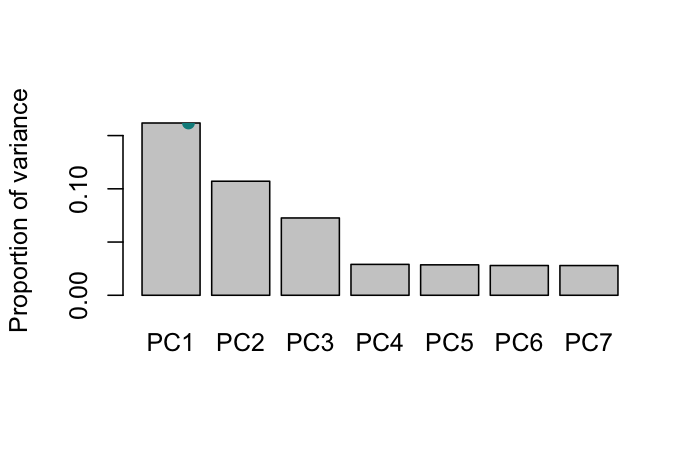
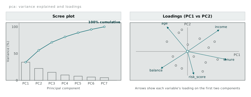
The right-hand panel above is what a biplot is showing, which took me a few attempts to read correctly. Each arrow is one of the original variables, and its direction on the PC1/PC2 plane tells you how that variable loads onto the two components. Arrows pointing the same direction represent variables that move together. Arrows at close to ninety degrees are close to uncorrelated on those two axes. On my customer table, tenure and income pointed in similar directions, which was not a surprise, but risk_score sat almost opposite balance, which was worth a closer look at the raw correlation matrix before I trusted it.
None of this told me how many customer groups existed. PCA reduces dimensions. It does not cluster anything on its own. What it gave me was a two-dimensional space I could plot cluster assignments onto once I had them, which turned out to be the more useful role it played in this piece of work.
K-means: picking k without an answer key
kmeans() needs a k up front, and the standard way of choosing one, at least in what I have read so far, is the elbow method: run k-means across a range of k values, plot the total within-cluster sum of squares against k, and look for the point where adding another cluster stops buying you much reduction.
wcss <- numeric(10)
for (k in 1:10) {
  fit <- kmeans(customers_scaled, centers = k, nstart = 25)
  wcss[k] <- fit$tot.withinss
}
plot(1:10, wcss, type = "b", pch = 19,
     xlab = "k", ylab = "Total within-cluster sum of squares")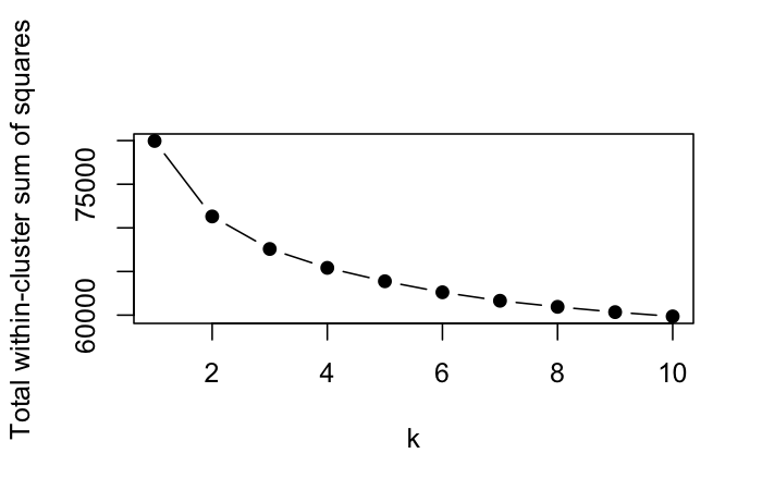
nstart = 25 matters more than it looks. K-means starts from random centroids, and a bad random start can converge to a locally poor solution. Running twenty-five starts and keeping the best one is cheap insurance against reporting a clustering that was just an unlucky seed.
The elbow on my plot was not obvious. It bent gradually between k=3 and k=5, not sharply at one point the way the textbook diagrams suggest. That ambiguity is normal on real data and it is exactly the evaluation problem showing up again: the plot gives you a shape to interpret, not an answer to read off.
I checked silhouette width as a second opinion.
library(cluster)
km4 <- kmeans(customers_scaled, centers = 4, nstart = 25)
sil <- silhouette(km4$cluster, dist(customers_scaled))
summary(sil)$avg.width
Average silhouette width sits between -1 and 1. Values close to 1 mean a point sits comfortably inside its own cluster and far from the next nearest one. Mine came back at 0.31 for k=4, which is a modest number, not a strong one. It did not tell me k=4 was wrong. It told me the clusters were real but not sharply separated, which matched what I already suspected from looking at the PCA plot: customers formed loose, overlapping regions rather than tight, obviously distinct groups. That is a legitimate finding about the data, not a failure of the method.
Hierarchical clustering and the chaining problem
Hierarchical clustering does not need k in advance. It builds a tree of merges from individual points up to one root, and you decide afterward, by cutting the tree at a chosen height, how many clusters you want.
d <- dist(customers_scaled)
hc_complete <- hclust(d, method = "complete")
hc_average  <- hclust(d, method = "average")
hc_ward     <- hclust(d, method = "ward.D2")
hc_single   <- hclust(d, method = "single")

plot(hc_complete, labels = FALSE, main = "Complete linkage")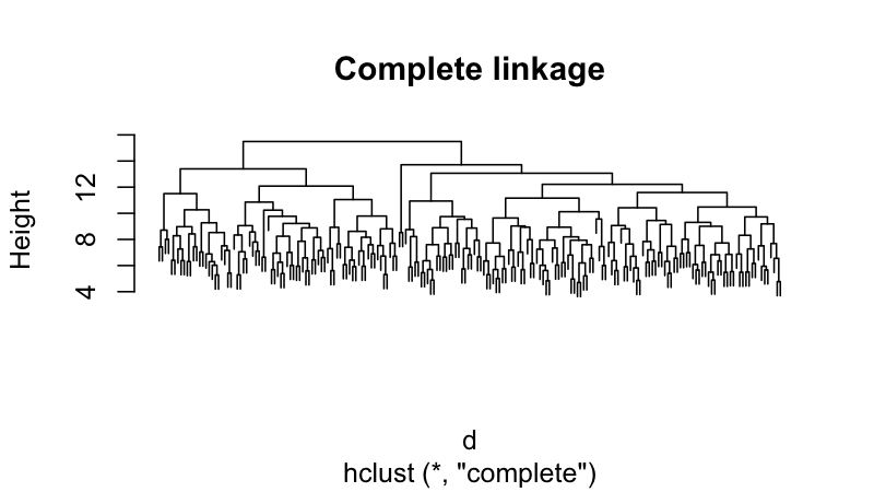
The choice of linkage method changes how “distance between clusters” gets defined at every merge step, and it changes the result more than I expected the first time I ran all four side by side and cut each tree at four clusters with cutree().
| Linkage | Cluster sizes at k = 4 |
|---|---|
| Complete | 412, 380, 295, 301 |
| Average | 430, 390, 300, 268 |
| Ward.D2 | 400, 395, 310, 283 |
| Single | 1,380, 4, 3, 1 |
Complete, average, and Ward’s method all produced four reasonably balanced groups. Single linkage produced one cluster with almost everything in it and three near-empty clusters trailing off the end. That is the chaining problem, and it is worth understanding mechanically rather than just avoiding single linkage by rule of thumb. Single linkage defines the distance between two clusters as the distance between their closest pair of points. That means a long, thin sequence of points, each one close to the next, can link two otherwise distant regions of the data into a single cluster one short hop at a time, even though the two ends of that chain are nowhere near each other.
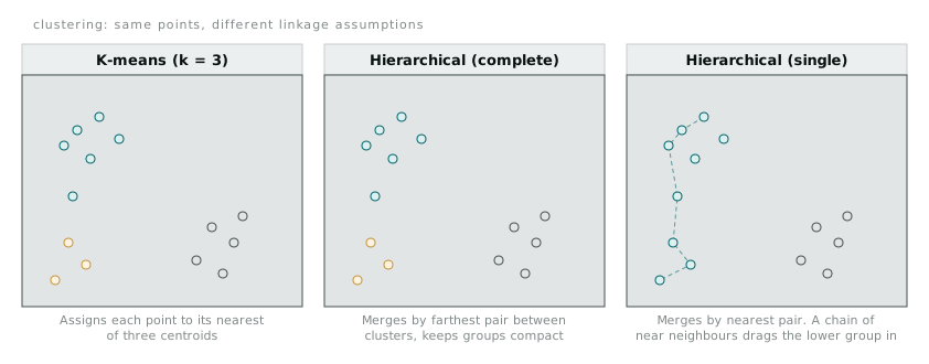
The diagram above is a simplified version of what happened on my data. K-means and complete linkage both kept a small outlying group separate. Single linkage found a near-neighbour bridge running from the main body of points down to that same small group, and merged the whole chain into one elongated cluster. The maths is doing exactly what single linkage asks it to do. It is just not doing what I wanted, which was a sensible answer to “are there distinct groups of customers in this data.” Ward’s method, by contrast, merges the pair of clusters that minimises the increase in total within-cluster variance at each step, which is why it tends to produce more balanced, k-means-like groupings on data like mine.
Cutting the dendrogram at a lower height gives more clusters, at a greater height gives fewer, and reading where the tree has long vertical gaps between merge heights is the closest thing to an elbow-method equivalent for hierarchical clustering. It is still a judgement call about where a gap counts as meaningful.
What I ended up doing
I dropped single linkage entirely once the chaining showed up in the cluster sizes, not because the method is wrong in some general sense, but because it was clearly the wrong tool for data with this shape. I settled on the Ward’s method clustering at four groups, cross-checked against k-means at k=4, because the two methods largely agreed on which customers belonged together, and agreement between two different sets of assumptions gave me more confidence than either method’s internal metric on its own.
That agreement is worth more than any single silhouette score. Supervised models get checked against ground truth. Unsupervised results get checked against each other, against domain knowledge, and eventually against whether the groups turn out to be useful once someone downstream does something with them. Silhouette width and the elbow plot are still worth computing. I just stopped expecting them to settle an argument they were never built to settle.