For the first two months of a large-scale Microsoft Fabric project, I was building Power BI reports the way I had always built them. Embedded semantic model in the PBIX file. Measures defined locally. Relationships managed inside the report. On a 64 GB machine, opening three reports simultaneously would bring the development environment to a crawl. RAM climbing past 20 GB to render a preview of one dense financial layout. Fan noise loud enough to time meetings by.
Then the architecture changed, and the machine went quiet.
Power BI Desktop dropped to 800 MB of RAM. Twenty-five reports, the eleventh open with scheduling and project finance visuals, and my development machine was coasting. The PBIX file had nothing in it. No embedded model. No local relationships. No measures computed on my hardware. The file was a visual layer and nothing more. Every join, every DAX measure, every relationship lived in a Fabric semantic model in the cloud, connected via Direct Lake.
My machine was drawing pictures. The cloud was doing the maths.
The project
A large programme management reporting platform. Twenty-five distinct Power BI reports, each serving different stakeholder groups with different requirements. Some focussed on financial tracking and cost performance. Others on scheduling, resource allocation, and project delivery milestones. A few combined operational data from Workday with programme management outputs for workforce analytics.
All reports drew from a common set of data sources landing in a single Fabric delta lake warehouse. Different source systems, different formats, different update frequencies. The constraint that pushed us towards Microsoft Fabric was organisational: the enterprise platform was already there, the licensing was covered, and the stakeholders needed Power BI as the delivery surface. Not every project gets to pick its tools.
What I got to pick was the architecture.
Why embedded models break at twenty-five reports
The default Power BI development pattern works fine for a handful of reports. You build a semantic model inside the PBIX file, define your measures, set up your relationships, publish to the Power BI Service, and move on. For five reports this is manageable. For twenty-five reports built on overlapping data from the same lakehouse, it collapses.
The problems are structural:
-
Duplicated logic. The same revenue calculation, the same date intelligence, the same status mapping replicated across a dozen files. When the business definition changes (and it will), you are hunting through every PBIX file to find and update every instance.
-
RAM consumption. Each embedded model loads data into memory on your development machine. Three reports open simultaneously can consume more RAM than the actual reporting surface justifies, because each one is holding its own copy of overlapping datasets.
-
Developer bottleneck. A PBIX file with an embedded model ties the model author to the report author. If someone is building visuals while someone else needs to change a relationship, they are blocking each other. At twenty-five reports this becomes a scheduling problem.
-
Drift. Over twelve months, measures that started identical diverge. One report rounds to two decimal places. Another truncates. A third uses a slightly different filter context. Nobody notices until a stakeholder compares two dashboards in the same meeting and asks why the numbers disagree.
These are not edge cases. They are the default outcome of embedded-model development at scale.
Medallion architecture in Fabric
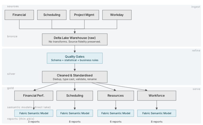
The data architecture follows a medallion pattern (bronze, silver, gold) implemented entirely in Microsoft Fabric artefacts.
Bronze layer. Raw data from source systems lands in the delta lake warehouse with minimal transformation. Financial data, scheduling exports, project management extracts, and Workday feeds each arrive through their own ingestion pipeline. The bronze layer preserves source fidelity. No business logic, no renaming, no filtering. If the source sends nulls, bronze stores nulls.
Silver layer. Cleaned and standardised. Deduplication, type casting, column renaming to a consistent convention, and basic validation. This is where I apply data quality gates to catch upstream problems before they propagate. A scheduling record missing its project identifier fails at silver, not in a report visual three layers later.
Gold layer. Report-specific aggregations and business logic. Each report (or logical group of reports) has its own gold-layer tables tailored to its analytical requirements. A financial performance report gets pre-aggregated cost and forecast comparisons. A resource utilisation report gets headcount pivots by period and department.
The transformations between layers use a combination of Fabric dataflows and notebooks. Dataflows handle the straightforward standardisation work. Notebooks handle anything requiring Python, such as complex date logic, cross-source reconciliation, or custom validation rules that are easier to express in code than in Power Query M.
One lakehouse. Three layers. Twenty-five reports fed from the same governed source of truth.
Decoupling the semantic model
This was the single most consequential architecture decision in the project.
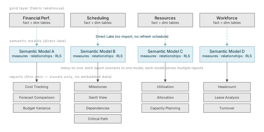
Instead of embedding a semantic model in each PBIX file, I created Fabric semantic models as standalone artefacts in the workspace. Each semantic model connects to its gold-layer tables via Direct Lake. The Power BI reports then connect to the semantic model as a live connection, with no data imported locally.
The PBIX file becomes a thin visual layer. It contains pages, visuals, filters, bookmarks, formatting, and layout. It does not contain data, measures, relationships, or calculation logic. All of that lives in the Fabric semantic model.
Why this matters
One model, many reports. A single semantic model can serve multiple Power BI reports. If three reports share the same financial dataset, they share one model. Changes to measures or relationships propagate to all three automatically. The relationship between reports and models is many-to-one.
Independent development. Report developers can build and modify visuals without waiting on model changes. Model developers can add measures, adjust relationships, or modify hierarchies without blocking anyone working on report layout. At twenty-five reports with multiple contributors, this separation is not optional. It is load-bearing.
Always-current data. Direct Lake mode reads directly from delta lake tables in the Fabric lakehouse. There is no scheduled import refresh. When the data pipeline updates a gold-layer table, any report connected via Direct Lake sees the new data on the next query. Reports show current data without a refresh schedule managing staleness.
Minimal local resource consumption. Because the PBIX file contains no embedded model, Power BI Desktop on my machine does not load data into memory. It renders visuals by querying the cloud semantic model. The 64 GB machine that used to struggle with three open reports now runs a dozen report files simultaneously without pressure.
The Fabric semantic model as the logic layer
Every DAX measure, every table relationship, every calculated column, every hierarchy, and every role-level security rule lives in the Fabric semantic model. This includes:
-
Measures. Revenue, cost, variance, forecast accuracy, schedule performance indices, earned value metrics. Hundreds of measures across the full set of models, all defined in one place per analytical domain.
-
Relationships. Star schema relationships between fact and dimension tables, with clear grain definitions. Cross-source relationships (linking project management records to financial records to scheduling milestones) defined once and shared across every report that needs them.
-
Calculation groups. Time intelligence patterns (year-to-date, prior period, rolling averages) defined as calculation groups rather than duplicated across individual measures.
-
Row-level security. Access rules that restrict data by project, division, or cost centre, defined in the model and enforced automatically across every connected report.
I cover the development workflow for building these measures and relationships at scale (including how I used AI agents and TE2 C# scripting to define hundreds of measures without manual editing) in a companion article on loop engineering for Fabric.
The development workflow
Each of the twenty-five reports follows a consistent folder structure:
project-root/
├── agents.md                    # project-level guardrails
├── report-financial-performance/
│   ├── docs/                    # stakeholder requirements
│   ├── memorybank/              # implementation context
│   ├── report.pbix              # thin visual layer
│   ├── model/                   # fabric semantic model definition
│   ├── dataflows/               # transformation logic
│   └── notebooks/               # python processing
├── report-schedule-tracking/
│   ├── docs/
│   ├── memorybank/
│   ...
The agents.md file at the project root defines every development convention: naming patterns for measures, table prefixes, DAX formatting rules, relationship modelling principles, and documentation standards. This file is the single source of truth for how artefacts are built across all twenty-five reports. Any developer (or AI agent) working on any report inherits the same constraints.
The docs/ folder holds the original stakeholder requirements for that report. The memorybank/ folder retains implementation context, decision history, and notes that carry across development sessions. Both exist so that coming back to a report after weeks away does not require rediscovering what was already decided.
Automated pipelines and access management
Data pipelines in Fabric handle the refresh orchestration. Source data arrives on different schedules (some daily, some weekly, some near-real-time), and each pipeline manages its own cadence and error handling. A failed financial data refresh does not block a scheduling data pipeline. Failures surface in monitoring, not in broken reports.
Access management follows a pattern I wish more organisations adopted: distribution lists managed by a separate team. Developers do not manage who can see which reports. A governance team maintains dynamic distribution lists, adding and removing members based on role changes and project assignments. The developers ensure the right reports are published to the right app workspace and exposed to the right security groups. After that, access is someone else’s problem.
This separation works because the row-level security in the semantic model is the enforcement mechanism. Even if someone gains access to a workspace they should not see, the model restricts what data they can query. The distribution list is the front door. RLS is the lock on every room inside.
What works and what does not
What works
-
Development speed at scale. After the initial architecture investment, adding a new report is fast. Create the folder, define the gold-layer tables, build or extend the semantic model, connect a thin PBIX file, and start building visuals. The pattern is repeatable.
-
Cross-report consistency. Shared semantic models mean shared definitions. Revenue means the same thing everywhere it appears.
-
Resource efficiency. Developers can work on multiple reports simultaneously without their machines becoming unusable. This sounds minor until you multiply it across a twelve-month project.
-
Operational simplicity. Direct Lake removes an entire class of ‘stale data’ problems. There is no refresh schedule to debug at the report layer. If the pipeline ran, the data is current.
What does not work (or works less well than expected)
-
Fabric is young. Some features feel unfinished. Workspace management at scale has rough edges. Error messages from Direct Lake failures can be opaque. The tooling is improving but it is not mature the way Snowflake or Databricks tooling is mature.
-
Direct Lake limitations. Not every DAX pattern works efficiently in Direct Lake mode. Complex many-to-many relationships and certain time intelligence calculations can trigger fallback to DirectQuery, which is slower. Knowing when this happens requires monitoring query performance and understanding the fallback behaviour.
-
Vendor lock-in is real. The architecture is deeply embedded in the Microsoft ecosystem: Fabric lakehouse, Fabric semantic models, Power BI, Entra ID for security, distribution lists via Exchange. Moving this to a non-Microsoft stack would be a substantial migration. For this project the lock-in was acceptable because the organisation was already committed to Microsoft. For a greenfield choice, I would weigh this more carefully.
-
Learning curve. The decoupled model pattern is unfamiliar to most Power BI developers. The team needed time to stop treating the PBIX file as the centre of the universe and start thinking of it as a skin over a cloud model. That shift took weeks, not days.
-
Dataflow limitations. Fabric dataflows are adequate for simple transformations but limited for complex logic. Anything requiring conditional branching, loops, or multi-step validation is better handled in notebooks. The split between ‘use a dataflow’ and ‘use a notebook’ is a judgement call that new team members find confusing.
Where this connects
The architecture patterns in this project map directly to the principles in What Makes a Data Platform AI-Ready. A governed lakehouse with validated layers, consistent semantic definitions, and clear data lineage is the foundation that makes advanced analytics possible without making it fragile.
The twenty-five reports are a delivery surface. The architecture underneath them (medallion layers, quality gates, decoupled models, automated pipelines, governed access) is a data platform. The fact that the current consumers are Power BI reports does not limit the platform to Power BI. The same gold-layer tables that feed semantic models today could feed machine learning workloads, API endpoints, or operational dashboards tomorrow.
That is the point of building a platform instead of building reports. Reports are a deliverable. A platform is an investment.
And your development machine stays quiet.